
Color plays a powerful role in how art connects with people. It can shape mood, deliver contrast, and trigger deep emotion without words. That’s the foundation of color theory—understanding how colors interact and knowing how to use those interactions with purpose. In contemporary abstract art, where form and structure often give way to emotion and intuition, color becomes a language all its own. It draws viewers in through feeling, not explanation.
That idea is central to the work of Joe Papagoda. He doesn’t treat color as something passive. He treats it like a voice. His pieces use bold color pairings, soft blends, and unexpected transitions that follow emotion rather than strict design. Through his approach, Joe shows how color can be the whole message, not just a part of it. His work invites viewers to feel first and make sense of it later.
Key Takeaways
- Color is the core message in abstract art, guiding mood and meaning without words.
- Basic color theory, including the color wheel and schemes (complementary, analogous, triadic), helps artists shape emotion on purpose.
- Joe Papagoda uses intuitive color choices, bold contrasts, and gradual transitions to create honest emotional impact.
- The effect of a color depends on context, proportion, and pairing, not just warm or cool labels.
- Collectors can choose art by the feeling they want, then refine by light, contrast, and balance of bold and muted tones.
Basics Of Color Theory
Before diving into how artists like Joe use color in emotional ways, it's helpful to have a handle on the basics of color theory. At its heart, color theory helps bring structure to something that can otherwise feel chaotic. It starts with the color wheel, something many people first see in school but may not realize is a key tool for building art that connects.
The color wheel has three types of colors:
- Primary colors: Red, yellow, and blue. These are the building blocks of all other colors. They can't be made by mixing other shades.
- Secondary colors: These come from blending two primary ones. For example, mixing red and blue makes purple. Red and yellow make orange. Blue and yellow make green.
- Tertiary colors: These mix a primary color with a neighboring secondary color. Examples include red-orange or blue-green.
Once the wheel is familiar, artists can use color schemes to build feeling and focus. These include:
1. Complementary colors: Colors that sit opposite each other on the wheel, like red and green or blue and orange. They create strong visual contrast and can feel bold or intense.
2. Analogous colors: These sit next to each other on the wheel, like blue, blue-green, and green. They create a more calm and harmonious feeling.
3. Triadic colors: These form a triangle within the wheel, like red, yellow, and blue. This setup gives vibrant energy while keeping balance.
Using these groupings lets artists guide a viewer’s emotions more intentionally. Instead of guessing what colors might look good together, they use these tools to build mood. For example, a bright painting that uses complementary colors might feel energetic and exciting. One that uses analogous colors can feel quiet and comforting. In abstract art especially, these decisions are key, since the viewer is focusing on color and form rather than recognizable shapes.
Joe Papagoda's Unique Use Of Color
What makes Joe Papagoda’s work stand out is the emotional weight behind his color choices. He rarely sticks with what's expected. Instead of pairing colors the way traditional theory might recommend, he lets intuition lead. That’s part of the strength behind his art—it feels honest, even when the color combinations are surprising.
He might set a muted lavender beside a warm mustard yellow or follow a stormy gray with a hint of coral. The choices aren’t random, but they also don’t always follow the rules. Many of his pieces feature slow transitions between colors, like one hue bleeding into the next. This pacing mirrors how emotions can develop gradually—building, shifting, creating tension, then offering release.
Other times, his pieces strike fast. Solid blocks of color snap into place against each other, creating sudden impact. The work doesn’t just feel visual—it feels behavioral. It reacts to the viewer because Joe paints with feeling in mind.
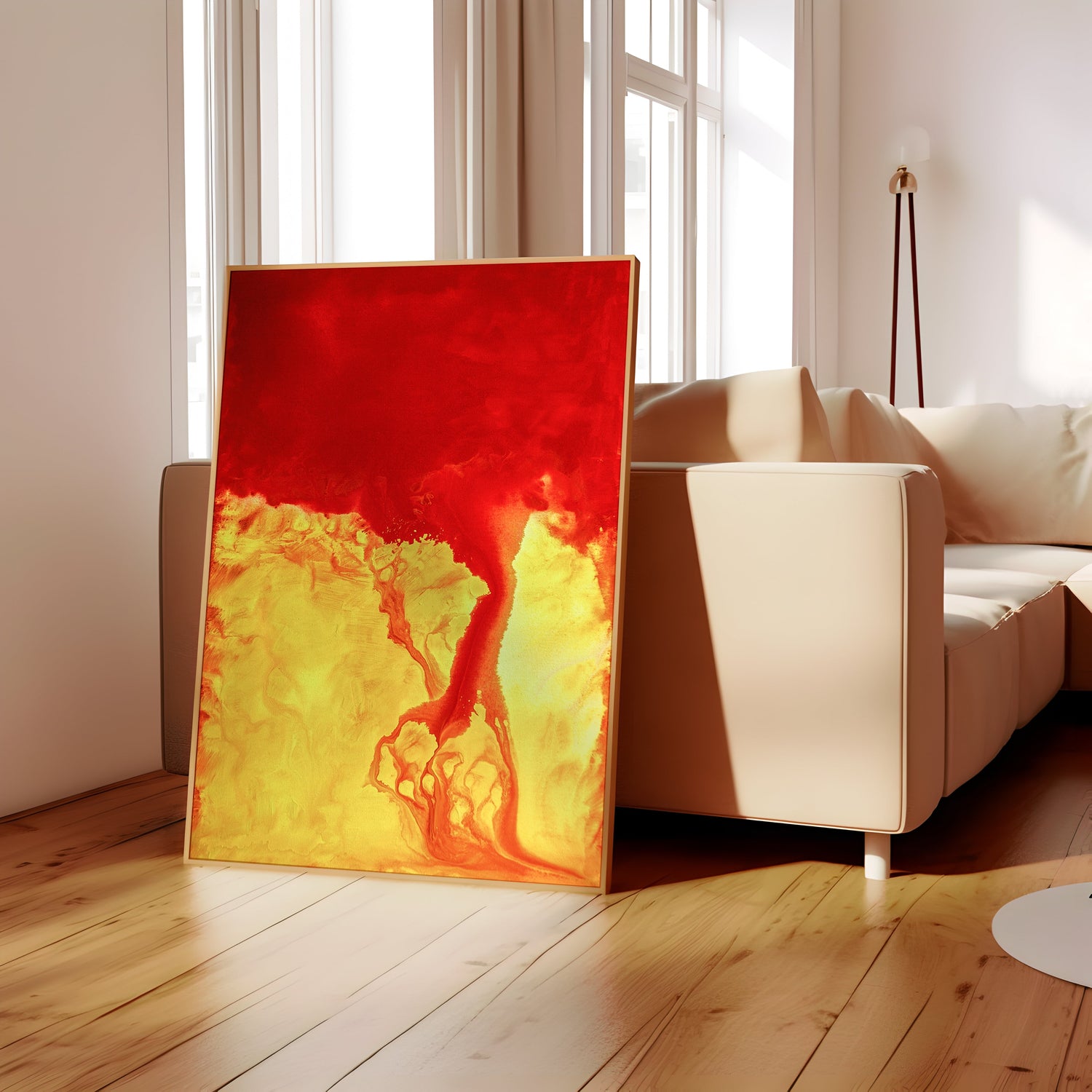
In one piece, deep reds stretch over a pale green base. Instead of softening the contrast, he lets both shine. The strong clash creates a sense of urgency. It doesn’t settle the eye, it sparks something instead. That push and pull is part of Joe’s signature. The work doesn’t ask for approval. It asks for connection.
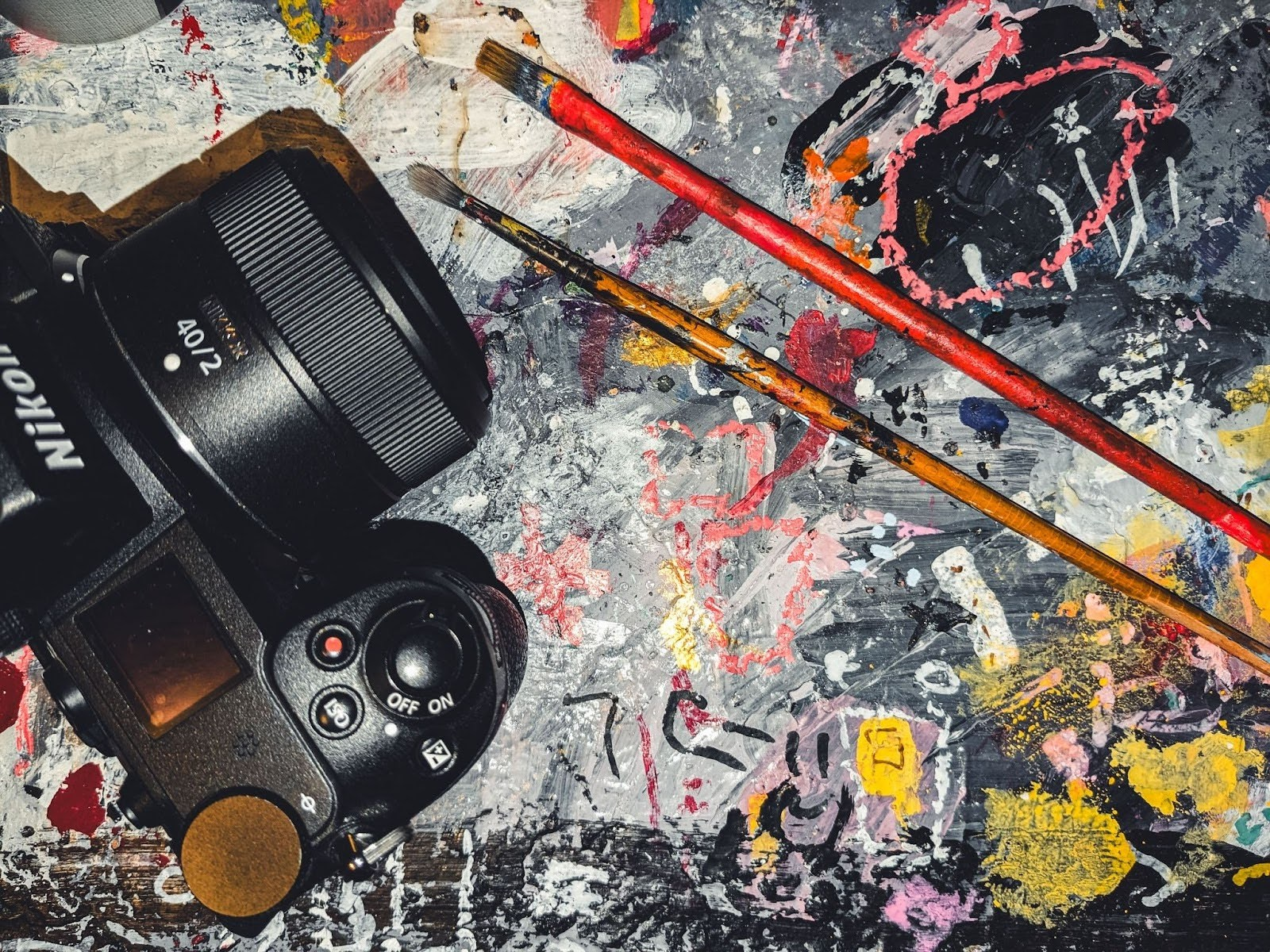
Because Joe comes from both a photography and painting background, he has a strong grasp of how light and layers affect perception. That insight deepens his use of tone. He knows how color shifts under different circumstances and how small adjustments can reshape feeling. The closer you look, the more you see—subtle fades, quiet edges, bold choices all working together to tell a story, even without a subject.
Psychological Impact Of Colors In Art
Color isn’t just visual. It impacts how we feel even when we don’t notice it happening. Warm colors—like red, yellow, and orange—tend to bring a sense of movement or energy. They can suggest urgency, joy, or heat. Cool colors—like blue, green, and purple—lean toward peace, quiet, and reflection. But it's not always that simple. The way a color is used, how much of it shows, and what it sits next to can shift its effect completely.
Joe plays with this emotional backdrop in clever ways. When he wants to show quiet, he might not rely on soft pastels or pale blues. He could use a desaturated green or a patch of ochre that gives a worn, lived-in feeling. The quiet comes from memory, not simplicity.
When he’s aiming for intensity, he often skips the usual reds and grabs something unexpected like a sharp coral or an off-pink shade. These choices grab attention but still feel grounded. That’s what makes people want to stay with a piece longer—they’re curious about what they’re feeling.
He layers feelings using color like some artists use words. The result is abstract work that isn’t just seen—it’s felt. Viewers might not be sure why they feel soothed or stirred, but they do. It happens before thought kicks in. Joe’s art reacts to where someone is emotionally, making it feel alive over time.
Tips For Art Collectors: Choosing Pieces Based On Color

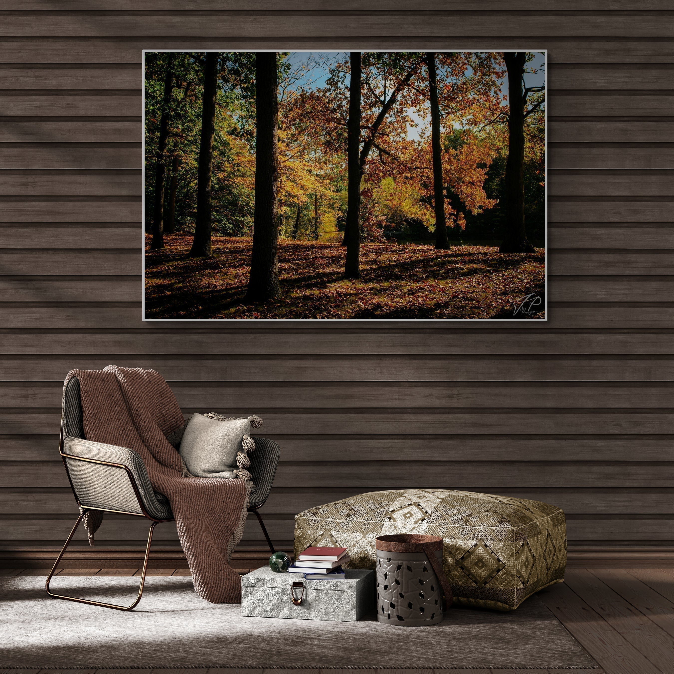
When buying abstract art, color should be more than a finishing touch. It sets the mood for your space and becomes a quiet part of your daily rhythm. Whether it's for your living room, office, or hallway wall, those colors will greet you each day. Having some insight into color theory can help you choose pieces that do more than match—they resonate.
Here are practical tips for choosing art based on color:
1. Start With Emotion, Not Furniture
Think about how a piece makes you feel. Does it bring a warm, calm, or electric energy? Let that guide your choice—even if it doesn’t match your couch.
2. Pay Attention To Light
Light plays a major role in how color shows. A bold blue may look vibrant in sunlight and deepen under a warm lamp. Try to see the piece in different lighting if you can.
3. Use Color To Wake Up Quiet Rooms
If a space feels too neutral, a colorful abstract piece can bring it to life. Strong greens, reds, or purples jump out even more in toned-down rooms.
4. Mix Bold With Soft
Love bright colors but don’t want to feel overwhelmed? Look for art that blends strong colors with muted ones. It keeps a piece dynamic without making a room feel noisy.
5. Factor In The Season
When buying during summer, rich earth tones like brick red or faded coral can feel just right. They carry warmth without adding too much heat.
Choosing art is personal, but leaning into color theory can fine-tune your instincts. Let the emotion of color lead, whether you're adding one piece or building a whole collection.
Discover The Emotional Power Of Color In Abstract Art

Color theory helps unlock what abstract art has to say. It’s not about rules. It’s about reaction. Artists like Joe Papagoda use their knowledge of hue, contrast, and mood to create pieces that stir something inside. Sometimes that’s peace. Other times, discomfort. Either way, the emotion sticks.
Joe brings care and boldness to every piece. His sense of rhythm in color is subtle but purposeful. He builds layers not just in paint but in feeling. These aren’t works made to blend into the background. They’re meant to hold your attention—and even shift your mood.
His work is proof that color doesn’t need words. It leads the eye and calls something inward. If you're building a space that reflects emotion, depth, or curiosity, his pieces invite you in. They don’t just show color. They show feeling.
Immerse yourself in the rich, layered emotions conveyed through color with abstract art by Joe Papagoda. Each piece invites a deeper look, pulling you into a world shaped by bold choices and subtle transitions. Explore the full collection at ArtFinest to find the artwork that speaks to your space and your story.
Experience the transformative power of color in modern art by Joe Papagoda. Each piece channels emotion through bold hues and thoughtful contrasts to create a connection that resonates deeply.
Let ArtFinest help you find the perfect artwork to inspire your space and amplify its unique story.
Frequently Asked Questions (FAQ) About Color Theory in Abstract Art
What is color theory and why does it matter in abstract art?
Color theory explains how colors relate on the color wheel and how different groupings affect mood. In abstract art, color often carries the full message. Using primary, secondary, and tertiary colors, plus schemes like complementary, analogous, and triadic, helps artists create contrast, harmony, or energy with intent.
How does Joe Papagoda use color differently from traditional approaches?
He lets intuition guide his choices instead of strict rules. He pairs unexpected colors, such as muted lavender with mustard yellow, and uses both slow blends and sharp blocks. This creates tension, release, and a direct emotional pull that feels honest and alive.
How do warm and cool colors affect how a piece feels?
Warm colors, like red, yellow, and orange, often feel active or urgent. Cool colors, like blue, green, and purple, tend to feel calm or reflective. Context changes everything. The amount of a color, what it sits next to, and how it transitions can shift the mood completely.
How should collectors choose abstract art based on color?
Start with feeling, not furniture. Decide the mood you want in the room. Then consider light, contrast, and balance. Strong colors can wake up neutral spaces. Mixing bold with muted tones keeps a piece dynamic without overwhelming a room.
Does lighting change how colors read in a painting?
Yes. Natural light, warm lamps, and low light each shift how colors appear. A bold blue can look bright in daylight and deeper under warm light. If possible, view the piece in different lighting before buying.